In this tutorial we will be discussing drag and drop items.
First, we will create a new folder. Right click on the ‘drag_and_drop’ folder, new /Directory. Enter the directory name, in my case I used ‘images’, look up the image that you want to use. Copy the image and paste it on the folder.
Go to ‘pubspec.yalm’ under the comment section write ‘assets:’ a dash and the name of the folder in my case it’s called ‘images’ then the name of the image. (example below)
After doing this we will now begin to work on the draggable item. Draggable is a class and it has a widget that can be dragged.
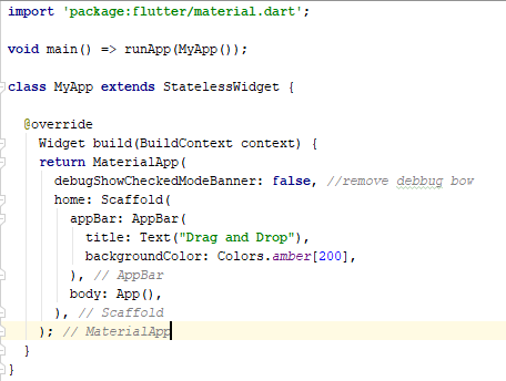
In the main we will execute MyApp, which is a class that returns a MaterialApp and the part that we will be working on is the ‘body’ the body calls the ‘App( )’.
Creating the Dragbox…Our dragbox will have three variables: the initial position, a label and a color. And the constructor.
The App( ) class and the AppState( ) class…
The App returns the AppState, inside the AppState we have a stack that has three draggable widgets, and the position.
Color caughtColor = Colors.grey;
This variable gives our drag target its default color.
The drag target has a builder and this has two list, one is for rejected and the other for accepted. We create a container for the size of the drag target and a decoration; the color of this will be based by a decision. If the target is empty it will get the color of the dragged object, if not then it will remain with the set default color.
Our draggable object needs a position, it can be top, bottom, left or right. In this case I’ll be using the left and the top(The position.dx and position.dy are the x axis and y axis respectively). The draggable has data which will give it the color ‘widget.itemColor’ and a child that has a container, this has a height and a width (you can set to preferred size or use the one displayed in the image). It also has decoration, BoxDecoration that allows us to edit the border, the color and add an image.
To add an image write:
decoration: BoxDecoration(
image: DecorationImage(
image: AssetImage('images/Zelda.jpg'),
fit: BoxFit.fill, //it can be fill, none, contain or cover
),
color: widget.itemColor,
),
image: DecorationImage(
image: AssetImage('images/Zelda.jpg'),
fit: BoxFit.fill, //it can be fill, none, contain or cover
),
color: widget.itemColor,
),
There are various function for a draggable, in our case we will be using ‘onDraggableCanceled( )’ so we can move our target around without it going back to its starting point.
And now we have the feedback of our draggable object, this what our object will look when its being dragged around. The feedback is basically a copy paste from the container little changes in the width and the height to make it different when its being dragged.
Final Code:
import 'package:flutter/material.dart';
void main() => runApp(MyApp());
class MyApp extends StatelessWidget {
@override
Widget build(BuildContext context) {
return MaterialApp(
home: Scaffold(
appBar: AppBar(
title: Text("Drag and Drop"),
backgroundColor: Colors.amber[200],
),
body: App(),
),
);
}
}
class App extends StatefulWidget {
@override
AppState createState() =>AppState();
}
class AppState extends State<App> {
Color caughtColor = Colors.grey;
@override
Widget build(BuildContext context) {
return Stack(
children: <Widget>[
DragBox(Offset(15.0, 25.0), 'Blue', Colors.lightBlue[100]),
DragBox(Offset(120.0, 25.0), 'Pink', Colors.pink[50]),
DragBox(Offset(225.0, 25.0), 'Green', Colors.green[100]),
Positioned(
left: 75.0,
bottom: 20.0,
child: DragTarget(
onAccept: (Color color) {
caughtColor = color;
},
builder: (
BuildContext context,
List<dynamic> accepted,
List<dynamic> rejected,
){
return Container(
width: 200.0,
height: 200.0,
decoration: BoxDecoration(
color: accepted.isEmpty ? caughtColor : Colors.grey.shade300,
),
child: Center(
child: Text("Drag here!"),
),
);
},
),
)
],
);
}
}
class DragBox extends StatefulWidget {
final Offset initialPos;
final String label;
final Color itemColor;
DragBox(this.initialPos, this.label, this.itemColor);
@override
DragBoxState createState() => DragBoxState();
}
class DragBoxState extends State<DragBox> {
Offset position = Offset(0.0, 0.0);
@override
void initState(){
super.initState();
position = widget.initialPos;
}
@override
Widget build(BuildContext context){
return Positioned(
left: position.dx,
top: position.dy,
child: Draggable(
data: widget.itemColor,
child: Container(
width: 100.0,
height: 100.0,
decoration: BoxDecoration(
image: DecorationImage(
image: AssetImage('images/Zelda.jpg'),
fit: BoxFit.fill,
),
color: widget.itemColor,
border: Border.all(
color: Colors.white,
width: 2.0,
),
),
child: Center(
child: Text(
widget.label,
style: TextStyle(
color: Colors.white,
decoration: TextDecoration.none,
fontSize: 20.0
),
),
),
),
onDraggableCanceled: (velocity, offset){
setState(() {
position = offset;
});
},
feedback: Container(
width: 120.0,
height: 120.0,
color: widget.itemColor.withOpacity(0.5),
child: Center(
child: Text(
widget.label,
style: TextStyle(
color: Colors.white,
decoration: TextDecoration.none,
fontSize: 18.0
),
),
),
),
),
);
}
}
This is very educational content and written well for a change. It's nice to see that some people still understand how to write a quality post.! drag drop builder
ReplyDeleteThanks for sharing, Its relatively easy to turn an existing deck into a three-season room and the project can often be completed in a few days. 3 Season Room with Fireplace.
ReplyDeletewww.decorationnew.my.id
www.decorationnew.my.id
www.decorationnew.my.id
www.decorationnew.my.id
www.decorationnew.my.id
www.decorationnew.my.id